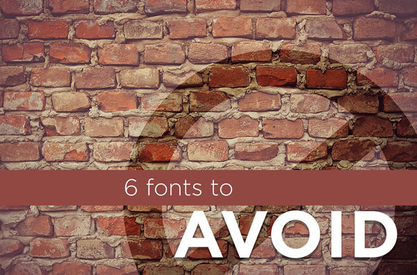
Last week you were given four great fonts to use in your designs. Well, this week you are told six fonts that you need to avoid at all costs. Why? Well take a look first because you might recognize some of them:

You may be wondering why these are so bad? Let me tell you. It really comes down to the fact that these fonts are used TOO much. Because they are so unique and identifiable, people notice them more. They definitely are not subtle fonts.
Think of it like this. You know how there are bad connotations with certain words? Even if you don’t know the bad connotation, other people do and will associate it with you. Do you want to be seen as a novice and inexperienced designer? Of course not! Those are the connotations associate with bad fonts. So don’t use them. Professional graphic designers were all taught this at one point so it is crucial we do not leave you out of the loop!
Sorry, I’m not providing download links this time because you shouldn’t download them!
let’s break it down and explain the reasoning behind each font:
Papyrus
I’m sure you’ve seen this one. For some reason everyone, at one point, thought using this font was the coolest thing to do. It was decorative and stylish because of its texture and “vibe” of the old days. Unfortunately it is not cool to use anymore. What it shows is a lack of good typography and that you are still a kid playing with all those fonts your computer came with.
Zapfino
This is another script font that people may find rather sophisticated and graceful. However, if you are a Mac user then you know this is a common font used on designs. I can’t tell you how many wedding announcements I get in the mail with this font. It’s a very fancy font that comes with a Mac computer so it is tempting to use it, but it’s just better not to.
Comic Sans
The biggest reason why you shouldn’t use this font is because you can’t help but think of a little kid writing a letter. You may be thinking it would be okay then to use it if that was your intention, but don’t. It’s overused so you shouldn’t use it too.
Mistral
This is another one of those playful, script fonts that you just shouldn’t use. It’s a common one that comes on most standard computers so it’s overused by many beginner designers. It may not be one of the worst, but it’s one that you should avoid because there are better choices out there.
Times New Roman
This may look familiar and it may not. But once you start writing paragraphs with this font it may come back to you. This used to be the default font for Microsoft Word before recent updates, but because of that you probably should stay away from it. You wouldn’t want people to automatically feel your design is boring just because it reminds them of those long essays they had to write, do you?
Brush Script
You may be confused about this font because it looks like a nice elegant one. It is. It’s a pretty script font that is tempting to use for those baby announcements, but I’m afraid it is just used too much. There are plenty of other script fonts out there that can satisfy your needs. I promise.