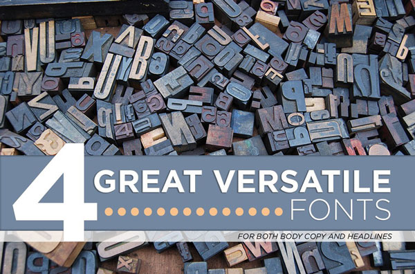
Ever wonder what fonts out there are appropriate to use? We all know the ones we should stay away from, but do we know which ones are actually good choices for body copy and/or headlines? Well fear no more because I have a list of 4 fonts (two serif and two sans-serif) that are versatile for body copy and headlines. You’ve probably heard of most of these fonts, but they’ve stood the test of time and are still acceptable and respected to this day.
Alright, let’s get down to it.
1. Helvetica
One of – if not the most – popular font out there for graphic designers is Helvetica. It was designed by Max Miedinger and Eduard Hoffmann. Helvetica is a great sans-serif font for those body copy or even headline needs. It’s a rather neutral font which is what makes it so nice to use. When using Helvetica for a headline, it is best to pair it with a serif for the body copy. This creates contrast within the design and helps to prevent a battle between two fonts that may clash. However, if you so desire to use it for body copy (and you can!) then it’s best to have a headline that is serif or modern. You just don’t want to use another sans-serif font for the headline if you are already using one for the body copy as you will risk them clashing.
From thefonty.com
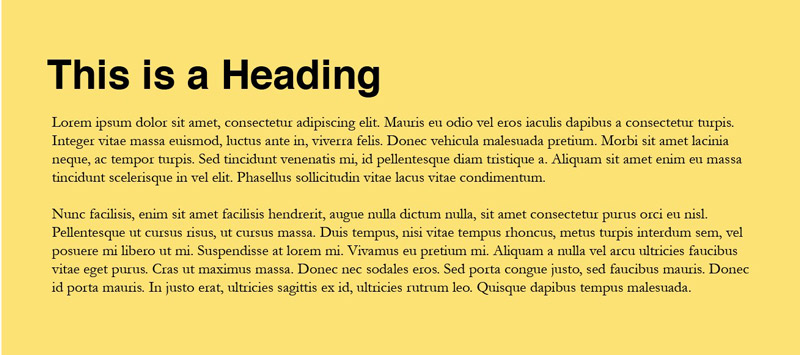
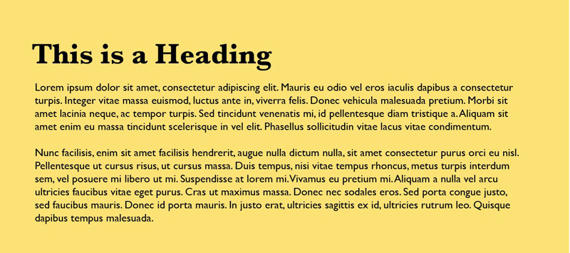
2. Garamond
Garamond is another great versatile font in the serif category. This beautifully designed font is great for headings and body copy. It’s a simple font yet has a little bit of character. Even though it is primarily used as body copy, notice in the picture on the right how it works for headlines, too. Designed by Robert Slimbach, Garamond is a respected font because of its Roman roots and subtle design.
From fontpalace.com
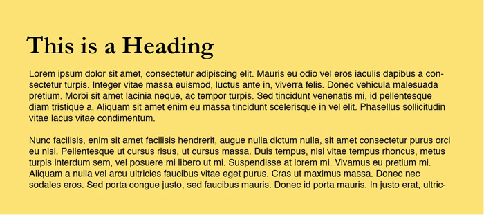
3. Gill Sans
The next font is Gill Sans. Another sans-serif, Gill Sans is a versatile font that is unlike any other. This font was designed by Eric Hill and is a great font to use for headings and body copy. Just like stated previously in this article, it is best to pair this with another serif font. Why is that? Contrast!
From fontsforweb.com
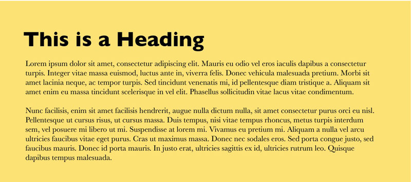
4. Baskerville
Baskerville is next. This serif font, designed by John Baskerville, is a beautiful font with soft serifs that are great for body copy or adding personality to a headline. Baskerville is a great font for print and web design. Don’t forget about the contrast principle – it’s very critical in typography.
From cooltext.com
Now that I’ve given you four versatile fonts, you might still be confused of how to best pair them. Here’s a tip: using serif and sans-serif together creates great contrast!